From Japanese Sumi-e Ink to Tree Cells Under a Microscope—and Back
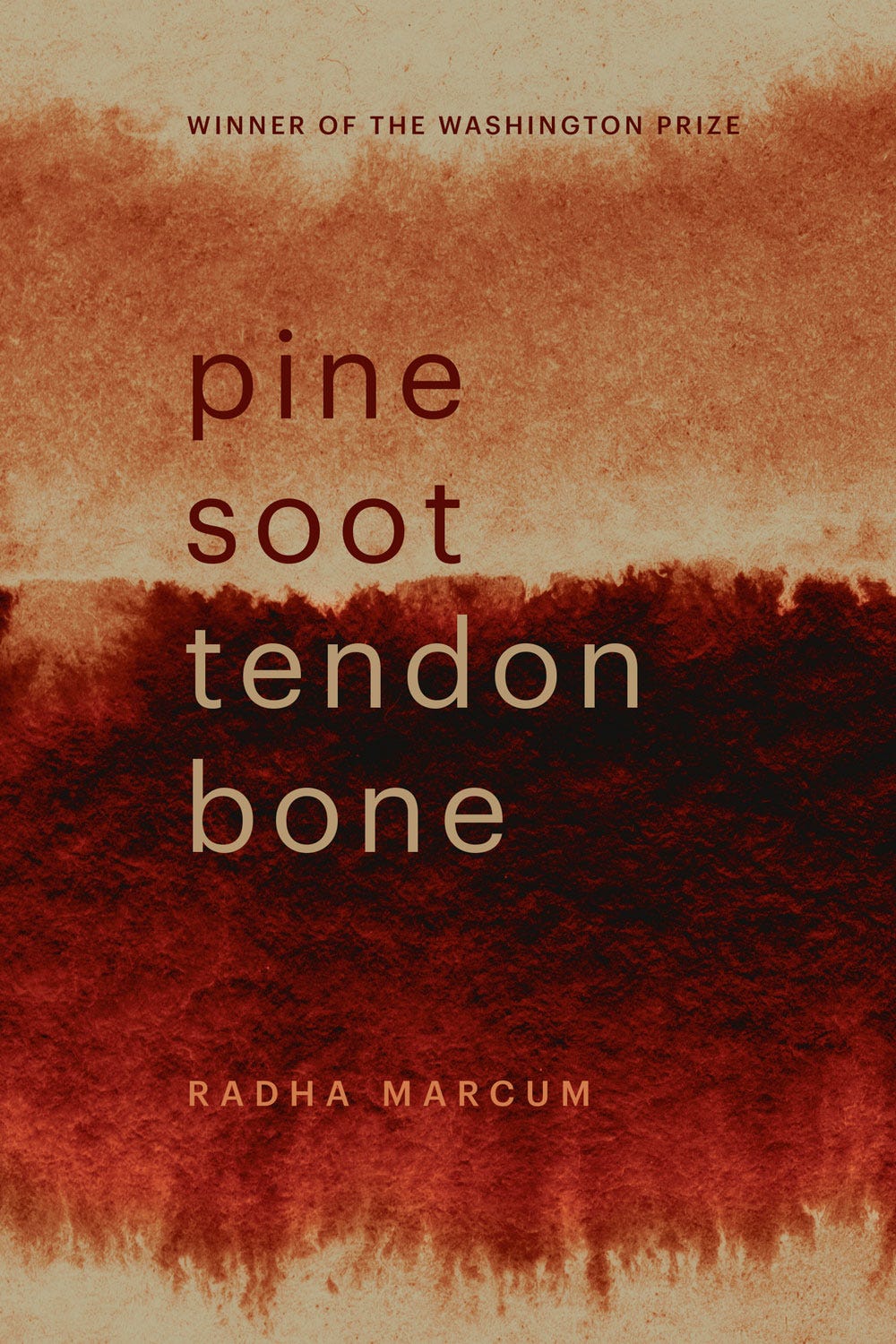
How we arrived—finally—at the cover for my new collection.
I’ve got an exceptional cover for my second book, due out in June, don’t you think?
I’m pretty sure it’s the right cover because, when I share it, people immediately ask when/where can they buy the book.*
*You’ll be the first to know when it’s available for order. Stay tuned!
The process of getting to this cover wasn’t easy—which is to the press’s credit. (I’ll explain …)
A while back, a reader here asked me to illuminate the process behind poetry book covers. I can’t speak for all poetry books—so much depends on the press—but here’s how it went for me this time around.
(It’s a bit of an epic …. I’m sorry, and you’re welcome?)
The final title and the cover-image direction co-arise
First, there was the book’s title. The selection committee and the Washington Prize series editor—the estimable Andrea Carter Brown—and I agreed that the manuscript’s working title wasn’t quite right.
As we dove into edits, Andrea and I went round and round on dozens of titles. When we got to Pine Soot Tendon Bone, Andrea’s poetic ear perked up. I wasn’t sure, though. One way to test it, I thought, would be to see how it read and felt on a mock cover.
Working purely by intuition, I found an abstract ink painting by Georgia O’Keeffe hidden in some online archives. It felt right for testing the title because it evoked the tone and themes of the book—fire, impermanence, beauty, solace in landscape and solitude. It read as both a person and as a landscape. The red oval at the center could be the sun as it appears through layers of atmospheric smoke an ash during a fire.
The title Pine Soot Tendon Bone refers to the traditional ingredients of Japanese sumi-e ink-stone and comes from a poem in the collection that takes inspiration from this painting by Japanese-American artist Kakunen Tsuruoka. I later learned that the O’Keeffe painting had been influenced by Arthur Wesley Dow who based his approach on techniques and principles of composition in Japanese art.
When I placed the title next to this image, I knew: Pine Soot Tendon Bone is the title.
From title testing to the trials of image sourcing
I had become so attached to the O’Keeffe image, I wanted it as the book’s cover. It suggested the book’s engagement with landscape, with earth and sun and sky objects, with darkness and grief as well as grace. Andrea and I agreed it would make an excellent cover—if only we could obtain the rights to use it.
I was optimistic. It would likely cost money—how much, I wanted to know. I was willing to shell out part of my prize money to have this perfect image. I inquired with The O’Keeffe Museum archive, where the image resides, which led to inquiries with other entities that actually deal with art rights/permissions. Finally, I got a dollar amount: about $800.
The price wasn’t prohibitive but, according to the agreement, the image would have to appear exactly as it is, without any image or text overlaying it. In a nutshell: No title could touch the painting.
Wild and desperate notions … returning to the qualities of the O’Keeffe
I struggled to pivot. I tried various approaches to finding a new image, from literal (ponderosa bark prints) to figurative (landscapes painted by Colorado artists) to scientific (pine tree cells photographed by a microscope).
There was a lot of back and forth with the press. I’d settle on an image, then my editor would point out its shortcomings—and I’d agree and go back to searching. Finally, I went back to the qualities we’d liked in the O’Keeffe and found a stock image of an abstract ink-wash that met these criteria.
It had gestural ink/watercolor brushstrokes, abstraction suggesting landscape, dark colors, saturation, imperfect edges.
It captured the book’s feeling/tone—rejecting figurative, representational imagery.
It could extend across the whole cover and allow for text overlay, while not appearing overly busy. I didn’t want the artwork or font choices overpower the title. Nor did I want the title to compete with the artwork. We looked for balance.
Once Andrea and I had chosen the image and font family and received approval on those from Nancy White, the press’s production editor, everything went to design. The designer, Susan Pearce, created several versions using different color schemes.
Differentiating this cover from the last cover
Then there was concern that the red color scheme would be too similar to my first book.
We agreed that they were different enough reds. We were satisfied that the images had different POVs, textures, and palettes. (The first cover, which I also love, is an image taken from space of Los Alamos, the Valles Caldera, and the greater Santa Fe region.)
Nearly always a challenge for poets
One poet I know was so disappointed with the cover of his book, which he had little control over, that he apologized for it every time he read. Another paid for professional design work herself, knowing her press didn’t have optimal design resources to interpret the book’s topic. Others I know have gotten help from artist friends and poets who offer cover-finding services.
In a nutshell—the ideal cover often isn’t easy. It’s a good sign if the press is willing to take your input and be a partner in crafting the ideal cover. Be prepared to come up with the cover direction and to source imagery for the press yourself, if that is an option. You and the press will be happier with the result.
I’m so grateful that Andrea Carter Brown and The Word Works team were willing to collaborate with me—and that, together, we arrived at a cover that I’m certain will make me proud to promote the book for years and decades to come.
What do you like in a book cover? Any particular book covers you adore? Share in the comments.
Upcoming Events / Poet to Poet Community
How to Publish Poetry — Monthly Lunch & Learn
Get clear about what matters to publishing your poetry. The next session is May 1st. Get a free guest pass.


Photos can work too, although I think it helps if they connect to the writing, like how your first book’s cover image functions. Even after we’ve learned what we’re looking at, the image begins to stray: is it also a weird family tree, a map of veins and arteries, a strand of hair?
Since you asked, I looked around here and came up with three intriguing cover photos, all portraits:
https://www.rossgay.net/be-holding
I just finished Ross Gay’s book-length poem. He talks about the cover photo in his poem, pointing out details: the key around the woman’s neck, the boy’s aviator hat and what he appears to be holding: an origami bird. Library of Congress photo.
https://www.amazon.com/How-German-Walter-Abish/dp/0811207765
This photo that Abish’s wife Cecile shot gets stranger the longer you look at it: the military hat shades and hides the rider’s eyes, but below that it’s all summer fun, with the ridiculous print of his shirt, the naked legs, the bareback horse. And yet…
https://www.theguardian.com/music/2022/oct/21/alis-lesley-the-female-elvis-who-takes-centre-stage-on-bob-dylans-new-book-cover
These three rock pioneers toured Australia in 1957. Dylan doesn’t tell us anything about the photo, although Little Richard and Eddie Cochran might be recognizable, and Alis Lesley was an early female Elvis impersonator; Elvis liked her performance so much he recommended her for Richard’s tour.
I do love the cover and title and see how it fuses many aspects of Japanese art and yet it appears so Western-U.S. to me in a way I know will play in lovely ways with your poetry. I just worked out the cover for my forthcoming Amanda Chimera from Madville Publishing in an amazingly brief process with the press's designer, who read the book and created covers that picked up its images and themes brilliantly. I can't display it yet on-line but our only changes involved colors because the book's imagery has a marked color scheme which wasn't picked up in the initial versions. SUCH an amazing collaborative process. I have had to search for cover art myself in the past and it is so not easy. I agree with your point Radha, that it is utterly worthwhile, though, to find a cover that speaks of or to or for your book and that you love. I was lucky this time.